Use a Table element to show a list of records with search, sortable headings and paging. Choose an existing Table page creation option, add a Table element in the editor, or start with a Page starter.
Select the table on the canvas or in Layers. The breadcrumbs above its settings show the last three elements in its path. An ellipsis at the start means there are earlier parents. Select a breadcrumb to move to that parent; the last item is the current element. Hover over a shortened name to see its full name.
The settings are grouped into Properties, Appearance and Events. The selected group remains selected when you move between elements. Use Properties for records and columns, Appearance for layout and styling, and Events for actions supported by the element.
Section headings span the available panel width. Sections with no controls for the selected element are hidden; collapsing a section keeps its heading available so you can open it again.
In Properties, use Choose rows from this page to select a page or available surrounding-loop value. The picker only offers values available in that element's context. You can also enter a binding in Advanced rows binding, such as $page.records.
Open Sample value in the editor to inspect a small local example. It shows up to three list records and shortens large values. It does not call an endpoint or run a workflow. Path and loop values may be unavailable until the page runs. A missing sample does not mean the live page has no records.
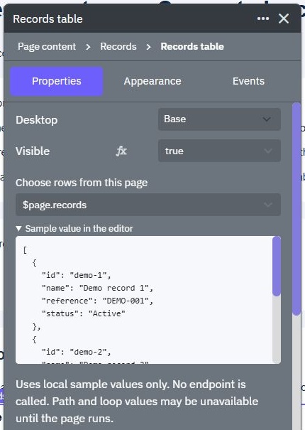
Charts and calendars offer the same scoped data picker and local sample view. See Page variables and Data Source Mappers for other page data controls.
Under Table columns, enter the field to display and its label.
Use Add column to include another field.
Use the arrow buttons to move a column up or down, or the remove button to delete it from the display.
Choose Apply columns to save the complete column list.
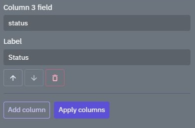
For example, use name with the label Product, or customer.name with the label Customer. Labels change what the heading says; they do not rename fields in your records. New field paths must be unique and use letters, numbers or underscores, with dots between nested fields. A segment must start with a letter or underscore. Up to 100 columns are supported.
Existing exact field names, including names with spaces, remain available when you change a label or reorder existing columns. Advanced columns (JSON) retains the previous JSON entry option for an existing configuration.
If the selected table or its saved version changes while you edit, the column controls refresh. Review the current columns before applying them again.
Enable Searchable to show the search control and Sortable columns to let customers choose a heading. Page size controls how many records are shown at once, from 1 to 100.
When Load pages from API is off, search, sort and paging work on the records already loaded into the page variable. They do not search the rest of your database.
Enable Load pages from API and enter the approved API URL. The read endpoint receives these query values:
page: Requested page, starting at 1.
pageSize: Requested number of records, up to 100.
search: Search text entered in the table.
sort: Field selected for sorting.
direction: Requested sort direction.
filters: Column filters, supplied as JSON.
Your endpoint must use those values and return the requested records plus the total number of matching records. The default response fields are rows for the list and total for the count.
If your response has a different layout, set Rows result field and Total result field. For example, use data.records and meta.total. Column paths are relative to each individual record, such as customer.name.
Requests run in Preview and published pages, not merely because you open table settings. This direct table URL does not automatically add an authentication header. Use an approved public read endpoint containing nonconfidential data, or configure and test an authenticated data-loading workflow separately. Do not weaken an existing protected endpoint to connect it here.
Each response is limited to 100 rows and 2 MiB. Responses outside the supported shape or size show a table error instead of silently loading all the data. Keep each response small and return a count that matches the endpoint's filtering.
When you copy a connected Page to another workspace, the copy starts disabled but keeps its original API URL and result fields. Review and deliberately reconnect the table to the approved destination endpoint before Preview, enabling or publishing. Copying endpoints alongside the Page does not automatically change its table URL. See Page starters.
Use endpoints that enforce customer access. Every read and change must be authorized by the endpoint; page visibility and browser-side filters are not access controls.
The table shows loading, empty and error feedback while records are retrieved. For local bindings, Loading binding and Error binding let your page variables describe the current state.
Preview an empty response and a failed request as well as a successful list. Test narrow layouts and long labels. Use Element States to keep hover, active and disabled controls readable.
Generating Form Pages
Generating form pages in Twidget enables the automatic creation of user input forms that can be utilized for various purposes such as lead generation, customer information retrieval, and interactive message boards. This functionality allows developers to directly map user inputs to form objects, whi...
Layout Controls
Layout controls are essential components in Twidget, allowing developers to manage the visibility and behavior of various layout elements, such as modals and drawers, within a user interface. These controls enable dynamic user interactions by facilitating the opening, closing, and toggling of layout...
Element States
Element states are fundamental attributes that define how elements visually respond to user interactions within the Twidget no-code API platform. Each element, such as buttons, input fields, or cards, can exist in multiple states, each with unique visual characteristics that enhance the user experie...
Element Actions
Element actions in Twidget are integral commands that can be assigned to user interface elements, enabling interactivity within applications. The actions are defined to respond to user inputs, primarily through triggering events associated with specific elements. Purpose of Element Actions. Element ...
Page Components
Page components are reusable building blocks within the Twidget platform that enhance development efficiency by allowing users to create, manage, and implement consistent UI elements across multiple pages. They serve to encapsulate functionality and design into a single entity, which can be reused a...