Twidget adapts its navigation, lists and editing panels to phones, tablets and smaller laptop windows. You can use the same workspace and saved workflows across these views.
On a phone, use the menu button at the top to open workspace navigation. Choose a tool from Build, Data or Test & monitor. The menu closes after you choose a destination so the page has room to work.
Related sections can stay open independently. Your current tool is highlighted, and Home, Dashboard, Help and Settings remain available. Use the account menu at the top for account options.
Use Close workspace navigation to dismiss the menu without opening another page. Your open tools also appear in the tab strip below the header. Swipe across the strip or use its arrows to reach more tabs; each tab has its own close button.
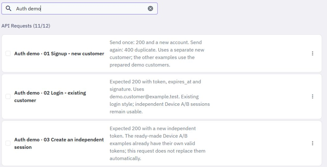
Endpoint, function, event, page, table and API request lists keep long names and descriptions inside their cards. Descriptions wrap onto additional lines, so you can read them without hovering over the text.
Search and creation controls move onto additional lines when needed. Use a card's three-dot menu for its actions. Checkboxes still select items for the existing group actions.
File cards show fewer columns on smaller screens. Long file and workspace names wrap so you can distinguish similar items. Connector action menus remain available on a phone.
Some tables contain more information than fits on a phone. Swipe sideways within the table to reach its other columns. Scroll the page normally to continue down the list.
Open a background job to show its details immediately below that job. Its details stay readable while you move across the wider table. The same approach keeps expanded request details close to their selected row in Logs & insights.
Customer details and independent sessions open beneath the selected customer on the Authentication page. On a phone, account information and session actions stack vertically. You can still search, filter and move through the results.
Invoices and credit history show labelled entries on narrow screens, making amounts, descriptions and dates easier to read.
Command panels and their dropdowns fit within the available screen space. Scroll inside a long panel to reach its remaining settings and actions. Long command names and values wrap where appropriate.
In an API request, the request method, URL and Send button rearrange for a narrow screen. Authorization fields remain available below the request settings. Responses with long messages stay within their response area.
Background jobs, test suites, realtime channels, releases and workflow templates also adapt their filters, forms and action areas to smaller windows.
The Pages editor is available on smaller screens. Its toolbar uses a compact layout, with some actions shown as icons. The view-size selector has its own row so it does not cover the editing actions.
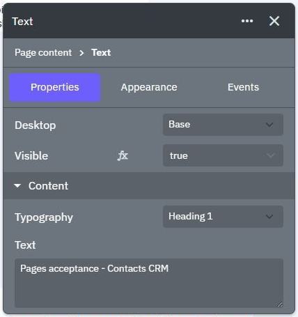
Use Add elements to open the element panel and tap an element to insert it. Close the panel when you want more room for the page. The selected element's settings panel remains bounded by the screen and can be scrolled to reach additional properties.
Choose a view size to inspect your page at different widths. Use Preview to review the result, then Return to Editor to continue editing. Reviewing a size or opening a preview does not publish the page; Publish remains a separate action.
For more help, see Commands, Testing, Workflow templates and Customer authentication tools.
Live debugging
Pause an isolated editor test before a command runs, move through it one step at a time, and inspect its recorded outputs. Use this to find where a calculation or decision begins to differ from what you expected. Start a debug test. 1. Open a server function, endpoint or event and choose Test. 2. Ch...
Testing
To pause an isolated test and move through commands, see [Live debugging](/docs/builder/live-debugging). In Twidget, you can easily test your endpoints and functions directly within our code builder. This guide will walk you through the steps to efficiently test your functions to ensure they meet yo...
Inputs
Overview. In Twidget, inputs are essential elements that allow you to configure endpoints and functions. Events do not use inputs. Endpoint Inputs. Endpoint inputs are used to retrieve data from requests. The available types of endpoint inputs are: 1. Path: Variables that are part of the URL path. 2...
Variables
Variables are essential building blocks in Twidget that allow you to store and manipulate data dynamically within your no-code applications. They enable you to create flexible and interactive applications by holding values that can be changed and referenced throughout your workflow. Creating Variabl...
Reusable Middleware
Middleware is a reusable workflow that runs before or after an endpoint, function or event. Build it once, then apply it wherever you need the same input checks, response formatting or logging. Create middleware. Open Middleware from the sidebar and choose Create Middleware. Give it a clear name, su...